It's Not All Black and White

Monday, July 30, 2007

Another Dirty Challenge

I can't say enough how much I love the challenges being posted this week for the Fan Club members on Splitcoast Stampers. This card follows two of the challenges from Wednesday and Friday, even though I just made it today. I think I'll be going back to these challenges long after the week is over. SweetMissDaisy's challenge (Wednesday) was to somehow involve a pet in your card, so I used my new Fluffles stamp. I also used the sketch by Julia S (Friday), turned sideways though, to accommodate my stamp.

I stamped Snail Fluffles by Stampendous with TimberBrown Stazon on Pearlized White paper by Paper Accents (available at Verve Visual starting August 1st!!!). This is a thin shimmery paper, so I wasn't sure how it would hold up to watercoloring, but it did just fine. I went over the snail several times (because I kept changing my mind on what color he should be) and the paper warped slightly in that spot. But I adhered it to the chocolate chip layer with a thin solid bead of glue and all is well. The designer papers and that green squiggly piece are from Crate Paper's Carnival Collection. I sponged the edges of the green with close to cocoa, because it need a little contrast to show up better. The background is apricot appeal wheeled with the Rough Texture jumbo wheel (stampin up) in pumpkin pie. I paper pierced the edges and did the faux stitching with a chocolate chip marker. The edges are distressed with the Tonic paper distresser. The sentiment is from Verve Visual's Thoughtful Phrases set, punched with Stampin' Up's word window tab punch. I finished off the layout with a We R Memory Keepers eyelet.

Recipe:
Stamps: Verve Visual Thoughtful Phrases, Stampendous Snail Fluffles, Stampin' Up! rough texture jumbo wheel
Ink: timber brown stazon, close to cocoa, choc chip, pumpkin pie, old olive, brocade blue
Paper: Paper Accents pearlized white, Crate Paper carnival collection, SU! choc chip, apricot appeal and pumpkin pie
Other: paper piercer and template, tonic distresser, aquapainter, sponge dauber, we r memory keepers designer eyelets: homemade

So, speaking of Verve Visual...have you checked out the site yet. I'm a little behind bringing you the news, but you can see the genius behind this new line of stamps, here. The actual store will launch August 1st. That means you have until tommorrow to sign up for the newsletter before the grand opening.

Ah!!!! I just looked at my calendar and saw I have a doctor's appointment in a little over an hour. Gotta run. Talk to y'all soon.

Saturday, July 28, 2007

Dirty Dozen's Pure Joy

Today I got to do another of the challenges being presented by Splitcoast Stampers' Dirty Dozen. This was Thursday's sketch challenge created by Beate. Actually, it qualifies for Jen's challenge as well: to use only clear stamps. If you are a Fan Club member, you can see the link with the challenges here. If you're not a member, you may want to consider joining here.

My card starts with a 4-1/4 inch square certainly celery card base. The designer paper is by Me & My Big Ideas and is lined with Rose Red and stamped with a dotted border in Jumbo Java. The sentiment panel has a background stamped in Sahara Sand and lightly colored with Stampin' Up's Pure Color pencils to co-ordinate with the MAMBO designer paper. "PURE JOY" is stamped in Jumbo Java. The little flowers are also in Sahara Sand with a Cloud White center. The center is from Papertrey Ink's Paper Tray stamp set. All other stamps from Simply Stated by Fancy Pants. All inks are Versamagic's dew drop chalk inks.

I punched the flower (Martha Stewart) once from Rose Red and once from Apricot Appeal. The apricot flower edges, I sponged with rose red and softly folded the edges up for dimension. I punched two 1/8 inch holes in the flower to thread the American Crafts ribbon through and tie a knot. I highlighted the small flower centers and random areas of the Fancy Pants background with Star Dust Stickles.

Friday, July 27, 2007

RAK's: Thank You!

I got a couple more gorgeous cards in the mail over the last week to share with you. I commented on Charmaine's blog, Oodabug Alley, last week that Josh and I were celebrating our ten year anniversary, because Charmaine and her husband were also celebrating their anniversary. I swear it was the very next day (we live in the same city) that I got this beautiful card in the mail with anniversary wishes. Charmaine is such a sweetheart, and SO talented. Thanks Charmaine, I absolutely love the colors and style. What a sweet little pocket card the way it opens for the insert.


This second card is from Lynn Mercurio at Stamperostiy. Now I feel a little silly, but I couldn't decide if Lynn meant for it to be a vertical or a horizontal card, because it looked so good both ways. I love the corners and she even dry embossed! Thanks Lynn, it's so beautiful. That layered centerpiece is lovely.

Thursday, July 26, 2007

A Toile Challenge

I stamped! I feel like I have to get back in the groove. It's been almost a week since I stamped. I picked up Charles Dickens' Great Expectations to read on the flight home from Chicago. Once I start a book, I can't put it down. I'll read to the exclusion of almost all other things. So the book is done, and now I can stamp ; )

It's the third anniversary of the Dirty Dozen Design Team over at Splitcoast, so they're featuring a whole week's worth of challenges, starting with FOUR, that's right...FOUR, challenges yesterday. This card is for StamperSharon's monochromatic toile-look challenge.

Here's the lowdown:
Stamps: Tender Toile and Toile Blossoms (both SU! retired)
Ink: Ruby Red
Paper: Ruby Red, Very Vanilla
Other: JoAnn Essentials cream rick rack, sponge, cream organdy ribbon, marvy giga scallop circle punch, uniball signo white gel pen, coluzzle

Anniversary in Chicago

I can't believe the way life is flying by. But I'm back and even have a card to share with you in my next post. Last weekend was our ten year anniversary, and we spent it in Chicago. What a wonderful city! It's really beautiful and has so much variety. Our short (one hour) flight from Pittsburgh landed just before 7 am. So we headed to our hotel on Magnificent Mile (downtown shopping district) and had them hold our luggage. After a light breakfast at the Corner Bakery, we walked to the end of Michigan Ave, up along the lake front, through Lincoln Park Zoo and Conservatory, then diagonal through the city to Wrigley Field for lunch and an afternoon game. It was a five mile walk, so I felt totally justified eating some traditional Chicago deep dish pizza the next day at Pizzeria Due. By the way, we took a cab back. My husband's feet were hurting! Ha! It wasn't me for once.


Saturday we walked into town to check out the architecture, but it was so crowded that we didn't spend as much time as I would have liked. It was just too irritating. But I did go in the old Public Library. It's absolutely stunning! I'm such a lover of architecture. I'm fascinated by the most common homes. So this was such a treat. Everything is done in marble and mosaics. The ceilings soar. I just looked around and around, saying "wow!" The second picture here, is of Millenium Park, also very cool.

Sunday, we spent some time shopping, an interesting experience. There's Express (with an actual DJ inside) and Niketown, next to Burberry and Louis Vuitton. In other words, something for everyone.

I already want to go back again. I kept putting off making the arrangements to go, so I didn't put as much planning into where to go and what to do, as I usually would.

Thursday, July 19, 2007

Where Did I Go Wrong?

It's been a while since I've done any of the challenges at Splitcoast, so I've made myself do a couple this week. Yesterday, I posted my color challenge card and today I've got my sketch challenge card for you. I think I need to get back with the challenges. They push you to do what doesn't come naturally. They keep you from being stagnant. And eventually, they help you make better cards than this. I wasn't going to share this card. I'm not too happy with it, but, (1) I don't have anything else to show you today. (2) Maybe you can tell me where I went wrong. (3) Maybe you'll like it better than I do.

Stamps: SU! First in Fashion, Verve Visual Thoughtful Phrases
Ink: Versamagic dew drops in oasis green, red magic, and sage; black Versafine
Paper: Papertrey white, real red, Cosmo Cricket Dutch Girl
Other: black Sakura Gelly Roll pen, tiny rhinestones, dimensionals

Josh and I leave very early tomorrow morning for Chicago. It's our TEN YEAR anniversary! Can you believe it? I probably won't have anything to post until I get back. See ya Monday. Have a great weekend!

Wednesday, July 18, 2007

Apparently, *I ROCK*


I was so excited today when a couple of great bloggers listed me among their Five Rockin' Bloggers! Thanks Lauren (of My Time, My Creations, My Stampendence) and Karen (of Pottsplace). Now, I've seen that lots of you ladies have already been tagged, but I'm going to ignore that and just let you know five bloggers that I think ROCK, whether they've been tagged already or not.
1. Daniella Dobson makes the most stylish cards. And they're usually fairly simple, but I still stare wondering how she came up with such great designs.
2. Shannan Tuebner. Have you seen what this girl can do with a Rubber Romance stamp? So chic! No wonder she's an Eclectic Paperie featured blogger.
3. Leslie Miller makes the most downright beautiful cards. And I want to live in her garden. You should see the pics she shares occassionally.
4. Yeah, everybody loves Taylor VanBruggen, but so do I. Her cards are so good, that I can't even pin point what exactly it is that I love about them. They're just perfect every time.
5. Debbie Olson can color like no one's business. Some day I will stare at her creations for hours on end in the hopes that just a bit of that talent will wear off onto me.
So, no, I don't especially know these talented ladies, but they sure do ROCK the paper craft blogging world!

Blossoms, My Friend

I made this for yesterday's Color Challenge on Splitcoast, to use Bordering Blue, Not Quite Navy, Mellow Moss, and Always Artichoke (optional). I stamped everything (from Blossoms Abound) in the above colors. On the Bordering Blue layer, I stamped off once before using the Not Quite Navy and Always Artichoke, to keep the background more muted. The white paper is Papertrey Ink's stampers select, and the big eyelet is from the Peasant line of Designer eyelets and snaps by We R Memory Keepers. I finished off with dots of Star Dust Stickles on the flowers and a moss grosgrain ribbon.

Monday, July 16, 2007

A Couple More RAK's: THANK YOU!

I got a couple of RAK's from some very sweet ladies, one last week and one in today's mail.

This one came today from Michelle. You can see more wonderful creations at her Splitcoast gallery under the screen name MilwaukeeMommy. Michelle does some great coloring work and always has just the *cutest* stamps you've ever seen. Thanks Michelle, for the card and your very kind words. Both were much appreciated.


This second lovely card is from Nancy at Nancy's Creative Mess. I just love how she mixed together the Big and Little Pieces stamp sets. And she used some beautiful colors, which I *love*. Be sure to stop by Nancy's blog for lots of beautiful, often flowery, creations. You may even spot her sweet little dog, Milo. THANK YOU Nancy.

You Brighten My Day

Here's another card featuring the soon-to-be-released Verve Visual stamp set called Thoughtful Phrases. I started with a white card base of Papertrey Ink's stamper's select card stock. Next I layered on papers from Pink Martini's Pink Squirrel line. I was just recently introduced to these papers, and they are so vivid and fun. The top white layer is pearlized white by Paper Accents. The large brown and small blue/green flowers were cut out of Pink Martini paper, and I added a few primas as well.

The main panel was done by repeatedly stamping "you brighten my day" in different colors and then stamping the dotted border from the same set around one of the lines.

All the Goods:
Stamps: Thoughtful Phrases by Verve Visual
Ink: pink passion, cert celery, choc chip, always artichoke, brocade blue
Paper: Papertrey Ink white, Pink Squirrel by Pink Martini, Paper Accents' pearlized white
Accessories: star dust Stickles, primas, silver brads, May Arts ribbon, ticket corner punch

You still have time to sign up for Verve's newsletter before the grand opening, so click on the link at the beginning of this post to head on over there.

Friday, July 13, 2007

Same Card, Two Ways

I'm out of town for the weekend, but I found this picture on my laptop. I've never had one of my cards published, but this is the first one (of very few) that I ever submitted for publication. I submitted electronically for a color opposites design call, and the publisher asked that I send the cards in for consideration. Well, I sent them in, but nothing ever came of it. Their loss is your gain...right?!?

If I recall, I stamped this Inky Antics Champagne Girl on watercolor paper using black StazOn and colored with pretty in pink, certainly celery, rose red, creamy caramel, close to cocoa, and blush blossom markers. I highlighted with a glue pen and clear glitter. I also used celery grosgrain ribbon, paper piercer and template, and Karen Foster mini casual snap stamps. Enjoy your weekend. I'll try to post another card or two while I'm away.

Wednesday, July 11, 2007

Soon, Very Soon

Hi All. It would seem things are progressing. Verve Visual will be ready for you very soon. In fact, you can head on over there right now and sign up for their mailing list. That way you'll be the first to know when the sight launches. It could definately be worth your time to get on this mailing list very soon. *wink, wink, hint, hint*

Tuesday, July 10, 2007

The Rubber Review is In

Saturday, I received my review stamp set from Rubber Stamping Fun. So, here's my review:

We were able to choose our own stamp set, and I think this one is very pretty. A+ for the artwork.

It came well packaged for protection, in a padded envelope. It arrived quickly after I received a shipping notice. A+ on shipping.

As you can see, the presentation leaves something to be desired. The stamps came in this clear, almost Ziploc-like bag with a paper insert bearing the company logo. I don't know how I'm going to store my stamps, because I definately want to keep them as a set. I realize this is a review set, but I can only imagine this is their regular packaging as well. Please correct me if you know otherwise. The index stickers are nicely done though. As for the rubber, I'm pretty particular, so I would have trimmed my rubber more closely. It didn't affect the stamping at all though...no "shadows" from ink caught on the edges. C on presentation.

The rubber has a somewhat pitted look near the image. It doesn't seem to affect it's function at all though. The stamps accepted ink and stamped beautifully, even onto the rough texture of watercolor paper. The wood blocks with finger grips are very comfortable to use, just as most of us are accustomed. The rubber stamp lines up very well with the index sticker, so you have a good idea of what you are stamping and where. So, I give them a B on quality.

Overall, without knowing the price, I would definately suggest these stamps. They really are quite pretty. From what I see on RSF's website, they price their sets very reasonably, and the stamps are great to work with. This particular set isn't yet available for purchase that I can see, but check out their site and keep your eyes open for its release.

Here's some eye candy I came up with on my first go-round with my preview set, which I suggest they could name Cherry Blossoms or perhaps Oriental Gardens.

I Used:

Stamps: Review set #22 from Rubber Stamping Fun

Ink: TimberBrown Stazon; SU! pretty in pink, certainly celery, garden green, cameo coral, close to cocoa, bashful blue, chocolate chip; versamagic pink grapefruit

Paper: creamy caramel, pretty in pink, cameo coral, watercolor, Papertrey Ink white, Basic Grey Perhaps

Other: aquapainter, paper piercer, provocraft scallop scissors, slot punch, star dust stickles, ribbon from Michael's wooden spools

Monday, July 9, 2007

I've Got News!

So, have you heard of Verve Visual yet? It's a soon to be launched new stamp company. Why am I telling you about it? Because *I AM ON THE DESIGN TEAM* Yes, I am screaming and squealing right now. Especially since I totally love what I've seen so far. You are going to want these stamps. I was trying to wait to tell you about my design team gig until the stamps were set to release, but I wanted to use them on my ATC's for Jen del Muro's swap.

See that snazzy little sentiment with the dotted line underneath? That's part of Verve's first release. What you see is actually two stamps from the set. The words are separate from the line. And just check out how they fit in Stampin' Up's word window punch. I'm falling in love with this versatile little set already. And this is only the first time I've used it.

Now I know why I procrastinated so horribly with my ATC's. I just got my new stamps this Saturday. Woo Hoo!

The ATC:
Stamps: Hero Arts Decorative Birds; Verve Visual's Thoughtful Phrases
Ink: Versamark, versamarker, stampin' up basic black
Paper: bashful blue, vintage violet, DCWV glitter stack, whisper white, mega circle punch by Marvy, provocraft scallop scissors, pearl ex and Future floor finish, aquapainter, ribbon from Michael's wooden spools, black detail embossing powder

Friday, July 6, 2007

What's Your Take?

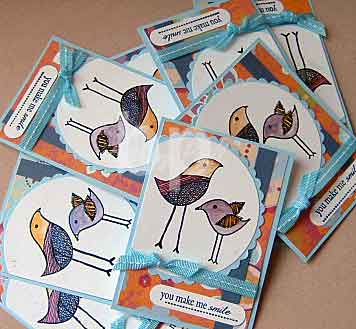
Just over a week ago, Adelina from Well Said Cards contacted me. She and her friend Angel wanted to get a small group of bloggers together to try a challenge. Would I like to participate? It sounded like fun, so I joined in. For this first try, Angel sent us all the same package of stamping goodies to see what we could all come up with. I can't wait to check out what the other ladies have done. I imagine we'll get some pretty different results, though we all used the same basic supplies. Be sure to go check out their results as well. Here's my take on these supplies:

I started with a white card base using Papertrey Ink's white card stock. I layered on the Paper Studio designer papers Angel sent. There are actually four birds in the Bird Border by Magenta, but I just framed out a couple of them with this Cheeky chipboard frame, which I covered in Versamagic chalk ink in Sahara Sand. The pink and white flower is also part of the chipboard, covered in cloud white and pink petunia, then coated with a thick layer of Crystal Effects and sprinkled with clear glitter. The birds are watercolored. The sentiment, from Papertrey Ink's Green Thumb, is stamped on white with Jumbo Java. The strip of chocolate chip, I cut with ProvoCraft scalloped scissors. This card came together amazingly fast for me. I like having a preset group of supplies to work with, especially since they all work together so well. Thanks for the package Angel.

Supplies:
Stamps: Bird Border by Magenta, Papertrey Ink's Green Thumb
Ink: Basic Brown, Versamagic jumbo java, cloud white, pink petunia, sahara sand, SU pretty in pink and certainly celery
Paper: Papertrey Ink's white, shimmer white, chocolate chip, The Paper Studio
Other: Cheeky chipboard, aquapainter, crystal effects, glitter, rhinestone, corner rounder, dimensionals, rick rack, linen thread, provocraft scallop scissors

And, here are the other ladies participating in the challenge. I can't wait to see what they've done. Stop on over and let them know I sent ya.

Rose Ann at Paper Delightz
Lori at Make A Difference
Adelina at Well Said Cards
Angel at Angelosity
Tracy at Here Comes Baby

Have a happy Friday and a great weekend!

Thursday, July 5, 2007

Just Droppin' a Line


This is Fishin' Petey by Inky Antics. Isn't he darling? He's been sitting in my drawer unloved for too long, so I pulled him out the other day. Petey's stamped on Whisper White with Black StazOn, then colored with prismacolor pencils and gamsol. I also added a bit of white Liquid Applique to his hat. The sentiment is also from Inky Antics, but it's usually just two lines. I used my Stamp-a-ma-jig and Night of Navy marker to make the sentiment fit onto this cuttlebug die cut. I added a couple of pieces of bling and it was ready to go.

The Goods:
Stamps: Inky Antics m2-10437-J and D4-10382-D
Ink: Black Stazon, night of navy marker
Paper: Papertrey Ink white; SU vintage violet, whisper white, and almost amethyst palette 'o prints; Chatterbox Olive Poolhouse Paisley (double-sided)
Other: Ticket corner punch, Darice gemstones from Mike's $ bin, American Crafts ribbon, dimensionals, cuttlebug flower die

It's really raining here in Pittsburgh today. In fact, we just started getting some thunder. My husband works outside for the most part, so I really feel for him on days like this. But, personally, not having to be outside, I LOVE storms. There's something beautiful about hearing the rain pounding on my roof and the thunder rolling in the background. Aaaaah.

Tuesday, July 3, 2007

Simple, Funky, Fresh

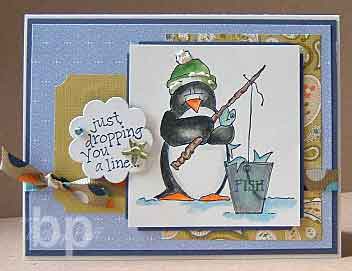
For this card, I used some of my winnings from the Caardvark's Bling Contest. It was a package from Jamie Horton of Top Line Creations. I got some very pretty stuff. Among my goodies was a Runway Circles Tressie Collection. It included all of these papers, except the white. The brown (used for the flower) is on the reverse side of the green dotted paper. I stamped the flower from Stampin' Up's Big Blooms in Versamark on the brown dotted paper and embossed with Clear EP. I stamped the flower again in Versamagic Tea Leaves, and cut out the center. I covered the dots with Lime Green Stickles and layered it on the flower with dimensionals. "Sweet" is from Stampin' Up's So Very set, and it is stamped with Versamagic Jumbo Java on a word window punch, accented with green thread, because it needed just a *little* something.


I Used:
Stamps: Stampin Up Big Blooms and So Very
Ink: Versamark, versamagic tea leaves and jumbo java
Paper: Top Line Creations Tressie Collection, Papertrey white
Other: dimensional, eyelets (sorry, source unknown), lime green stickles, american crafts ribbon, word window punch, 1/16th inch hole punch, cropodile, thread, clear ep


If you haven't joined the RAK group on Splitcoast Stampers, I seriously suggest you do. I received this lovely card from Terri. Her user name is rtecgarrett. Be sure to check out her gallery, because there is plenty more beauties like this one. Just look at that aged vellum layer. Mmmmmm. Thank you Terri. I just love it.


Check out this gorgeous card! It arrived in my mailbox a couple of days ago courtesy of the oh-so-talented Ms. Julee Tilman of Poetic Artistry. I wish every one of you could see this card in person. There's glitter on the primas and the hole punches in the photo corners. And the sentiment layer is a beautiful shimmery yellow. Hmmm, maybe she rolled yellow ink onto shimmer white card stock??? I've been putting it off too long, that shimmery white is on my next order with Stampin' Up. Big thanks Julee. I love it.


Lastly, but certainly not least, thanks to Debby Boltman. Her blog is Debby's Stuff. Debby tagged me to list seven things about myself. I had done that earlier, in this post, but wanted to give Debby a shout out, too. Stop by her blog and say "hi" if you've got an extra minute.