It's Not All Black and White

Thursday, June 11, 2009

Photo Rehab!

Thanks to a link from Kristina, I found THE BEST card photo tips I've seen to date. Check out the posts here and here on sideoats + scribbles! And the best part (aside from the fact that it WORKS) is that it is so easy! I used the instructions from that second link to get these before and after photos of the card I made today. Check it out:
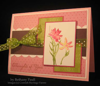

The first photo is done using a photo light tent and the indoor/no flash setting on my little hand held Canon PowerShot SD750. Next you see the same photo using the white balance instructions from Lisa that took all of 30 seconds in Photoshop Elements 5.0. I am seriously excited about this.
I went through a few old card photos that were still stored on my computer. These were photos that I had already edited using the "auto quick fix". It even made those so much better. And it worked every single time. Too cool, I say! Here are a couple of those. They were both taken outside with natural daylight.
So anyway, here are the details for today's pink flower card (the first one) using this week's Splitcoast sketch challenge. I colored directly on the rubber stamp (Silhouette Blooms I from Cornish Heritage Farms) with celery, olive, regal rose, rose red, and so saffron markers, spritzed with a light mist of water, and stamped on SU! whisper white.
Stamps- Silhouette Blooms I (CHF)
Paper- pretty in pink, white, choc chip, rose red, Bali Breeze (SU!)
Ink- celery, olive, regal rose, rose red, so saffron (SU!), vintage photo distress ink (Ranger)
Accessories- scallop punch (Martha Stewart), Dashes Dots & Checks ribbon
So, now can anybody tell me why there are no spaces in this post? Because there are as I'm typing in Blogger. Drives me crazy that it does that sometimes.

Wednesday, June 10, 2009

CPS119 To Infinity and Beyond

Wow, this week is really slipping away. I was exhausted from the weekend (weeding and LOTS of mulching) and before I knew it, the week's half over. Last night Josh and I went to eleven for the first time, a restaurant in the Strip District area of Pittsburgh, then walked to the Penguins game for an amazing, stressful, stunning Game six Stanley Cup Finals win over the Red Wings. I had the Alaskan halibut and Josh the lamb. Both were incredibly delicious.
On to the card. That's why you're here anyway, right? I wanted to do something for this week's CPS sketch. I just love extra tall cards like this. I stamped my hot air balloon on water color paper, masked it, and stamped a few clouds (all from Up, Up and Away). I colored with markers and a water brush, using pumpkin pie, kiwi kiss, ruby red, creamy caramel, chocolate chip, and bordering blue. For the flower embellishments, I glued some Perhaps paper to blank pieces of chipboard, then cut with my Cuttlebug Flowers die, then added a Making Memories snap to the center (which I colored with Copic YR07 to get a more vibrant orange). The sentiment is also on a larger CB flower die cut. I aged things a bit with a Tonic paper distresser and Papertrey Ink's new Vintage Touch Tea Dye Duo. Oh my word, that stuff is FAST and so cool. LOVE IT! Stamps- Up, Up and Away, Great Expectations (Verve)
Paper- bordering blue, pumpkin pie, kiwi kiss (SU!), water color (Strathmore), offbeat, perhaps (Basic Grey)
Ink- onyx black (Versafine), bordering blue, kiwi kiss, pumpkin, ruby, choc chip, caramel (SU!), tea dye (PTI)
Accessories- YR07 Copic marker, Making Memories snaps, CB flower dies, distresser, chipboard, Cosmo Cricket Everafter and Girl Friday ribbons, water brush, EK Success corner rounder

Friday, June 5, 2009

Bellarific Friday

It's Bellarific Friday, and this is my first time participating. I hope I got my card emailed to Em on time to be included, since I didn't see a deadline. I guess I'll find out soon when she posts the cards on her Blogabella. Here is the sketch she gave us on Monday to work with.
And here is my card. I used Flowahbella, stamping her on water color paper and coloring with SU! markers and a water brush, cut out with the Labels 1 die. The flowers are made from more of the paper pack used on the card, SU's Bali Breeze. The celery trim is punched with an EK Success Parisian punch. And I used a photo corner punch to get the end of the sentiment flag "just right" without a lot of fuss. MWAH! And chat with ya later!

Stamps- flowahbella (stamping bella), green thumb (papertrey ink) Paper- SU! bali breeze, vanilla, guava, water color Ink- onyx black (versafine), SU! markers Accessories- labels 1 die (spellbinders), cuttlebug flower #1 dies, ek success parisian punch, MAMBI icons, water brush, dimensionals, SU! photo corner punch

PS- Sometimes Blogger just makes me want to pull my hair out!

Thursday, June 4, 2009

Butterflies Make Me Smile

Especially polka dotted, striped butterflies. How cute is this stamp? It's another one I pulled out of my stash of pre-stamped images received from other stampers. It's so fun getting a chance to finally use some of those. I colored with Copic markers and used yesterday's sketch challenge from Splitcoast. I didn't have purple thread, so colored some with a Copic marker. Dang, those things have so many uses. I also colored the purple and green primas to match. The designer paper edges were roughed up with a hobby blade. I hope you find a reason to smile today too! HUGS! Stamps- Butterfly, Polka Dot (Lockhart Stamp Company), Thoughtful Florals (Verve Stamps)
Paper- white, SU! pale plum, perfect plum, saffron, old olive, Haiku
Ink- onyx black (VersaFine)
Accessories- copic markers (G21, YG63, V09, V15, Y21, 0), black diamond stickles, thread, sewing machine, primas, Martha Stewart butterfly punch, dimensionals

Wednesday, June 3, 2009

Clean and Simple 17

This week's clean and simple challenge on Splitcoast was to be inspired by your choice of beach towels or tote bags from Land's End. I chose this one.I took my inspiration from the colors and pattern and kept it "clean and simple" to come up with this. I stamped the pattern from Background Basics: Retro with onyx black VersaFine, and colored it with pink passion for the dots and a combo of celery and bashful blue for the diamonds. The bird, from Bird Watching Additions, is stamped with Raspberry Fizz and black, then I added black to the dots with a Zig Millennium pen and a crystal eye. Stamps- Bird Watching Additions, Background Basics: Retro, Simple Little Things (PTI)
Paper- white, black, PTI raspberry fizz, aqua mist
Ink- onyx black VersaFine, PTI raspberry fizz
Accessories- ribbon tag trio die (Spellbinders), paper piercer, PTI raspberry fizz satin ribbon, rhinestones

Tuesday, June 2, 2009

Mojo 89

Today's card is done with this week's Mojo Monday sketch. I used some older Basic Grey paper (Romani) and the new Verve set, Up, Up and Away. The piercing in the corner is done with an Ornare piercing template. FYI-it helps to set the template with a few straight pins, so it doesn't slide around while you're doing all that piercing. I paper pieced the balloon and treetop. The little bit of "trim" sticking out, is a strip of orange paper in the Romani collection that I stamped with a trim piece from the Up, Up and Away set. The sentiment is from So Happy. Stamps- Up, Up and Away, So Happy (Verve)
Paper- white, water color, SU red, Basic Grey Romani
Ink- black VersaFine, SU! choc chip, cocoa, bashful blue, caramel
Accessories- ornare template, piercer, SU brads, nesties, white gel pen, water brush, dimensionals

Monday, June 1, 2009

Getting My Verve On

I was SO EXCITED when I saw Verve's latest release. Really, how awesome is this tree? And it's not even the main image in the new Up, Up and Away set. I couldn't resist. I had to squeeze a little time in this morning for a quick card. Now I can't wait to find time to use all those gorgeous hot air balloons too. This card uses Fall-To Layout #44 from Clean & Simple. Definitely my go to place to get started on a quick and easy card. I stamped the trees on water color paper and colored with Stampin' Up! markers and a water brush. I used celery, olive, summer sun, and a bit of bashful blue faded out around the treetops. The pearls on the brad were white, so I added some coordinating color with YR07 Copic marker. For the scalloped trim on top, I cut with scalloped scissors. Marked my spots, and punched with a Crop-o-dile. The sentiment was a freebie with my Verve order.Stamps- Up, Up and Away (Verve)
Paper- celery, olive (SU!), water color (Strathmore), Romani (Basic Grey), white
Ink- VersaFine black, SU! markers
Accessories- Copic marker, K& Co. brad, American Crafts ribbon, water brush, dimensionals, scallop scissors, crop o dile